The Start of the Project

Inspiration


Focus
- I began by brainstorming about
character design.
- While working on my essay in the
kitchen, I stopped staring at a bowl of fruit. Suddenly something made me
realise that if shapes don't exist, this bowl wouldn't have been there.
Shapes are seen everywhere.
- This led me to decide on how
visual characteristic, shapes in particular can be used to effectively
communicate a character's personality.

Mind Map

Mind Map of Title :

Work Plan
For each book and article I read, I wrote down
the exact reference of the reading. I keep a file to jot down notes from the
readings, wheres also I wrote down inspiration that I can follow up later on.
Then I did a skeleton plan of various sections and sub-sections that will be
included in the chapter. Before I started writing a particular section, I read
all the notes jotted down and identify the notes for the sections.
This provided me with all the argumentation that I was amassed during
my readings.
The Start of the Project
Inspiration
Focus
- I began by brainstorming about
character design.
- While working on my essay in the
kitchen, I stopped staring at a bowl of fruit. Suddenly something made me
realise that if shapes don't exist, this bowl wouldn't have been there.
Shapes are seen everywhere.
- This led me to decide on how
visual characteristic, shapes in particular can be used to effectively
communicate a character's personality.
Mind Map
Mind Map of Title :
Work Plan
The Proposal Essay
My topic of the
investigation is about “ Communication of shapes in character design in animation. ( Personality) shape and texture the psychology behind it. ”. The aim of my
study is to investigate the character design in order to get a better
perception of how visual qualities, particularly shapes can be intentionally
character identity. I will be focusing on the production of a number of
character designs within two present game worlds, but it also involves a lot of
investigation previous to the actual production. I have related
information on the subject of character design and looked at other important
material in order to get a better understanding of how video games and animated
movie communicate different characters. I have also looked at a number of
different productions pipelines used by artists in the industry, to get a
better understanding of how the work process can be approached.
There are many
different types of characters to investigate and thus, I will have to limit
myself and work on two characters, game design such as the one“ Good ” and one
“ Evil ” character. This means that I will only focus on the visuals and most
of all, whether the character designs, communicates the projected personality
traits, the actual gameplay is irrelevant. The character design turns around a
combination of many different elements of art, but I delimited my study to
looking more specifically at shape. The resources I have used are information,
videos and online sources that are relevant to the subject.
The section
information of my investigation is divided into three-sections. The first
part, I will be dedicated on how physical influence the impressions of a
person's personality in character design. I will talk about visual message, and
these have to be clear, effective and exploring a character’s shape design.
Introduction
The aim of my study is to understand the skill of developing
a character design, and, to get a better observation of how visual
characteristics, mainly shapes, can be intentionally used in order to communicate
aspects of a character's qualities. Whether it is a film or a video game, it all relates to the characters. For
the audience, the enjoyment of a film or a video game tends to depend on a
character design. Despite the fact that characters are considered mostly for
their roles in a story, some layers of visual elements are employed to bring
their roles to life. Character design involves a mixture of many different
elements of art especially shapes. Several artists have argued that the main thing
about character outline is that the character, whether good or evil, must have
appeal and recount a story. Character design is constantly about the story as
much as the drawing. Artists use shape scaffolding to pre-visualize the final
structure, utilizing basic shapes to represent every component or segment.
Apart from making the volume and mass distribution of the figure, these shapes might
likewise help portray a certain identity, as is generally seen in adapting
cartoon drawings (Mattesi, 2008). The
resolve of my study is to further explore the art of character design for instance
video games. More right by studying how visual parts, shapes in particular, can
be used to really communicate a character's personality.
History of Character Design
From
the earliest cave paintings to the most recent animated film, artists have been
attempting to make still images that represent an expression of movement. This
is because most living things move and representing movement will bring the
artists closer to embodying life and
all extraordinary art exemplifies a sense of life. The history of art is loaded
with images of flying angels and combating soldiers on running horses. Some
modern artists such as the Futurists and Cubists created abstracted
representations showing multiple aspects of humans and objects suggesting the
images were moving or that the viewer was moving around the objects (Sullivan,
Schumer, Alexander, 2013).


" Rubber Hose characters "
 “ Walt Disney ”
In the
early 20th century, when 2D animation was still in its early years, there were
few restrictions to the appearance of animated characters. However, simple rounded
cartoon characters were developed. The character’s limbs were rubbery, twisty,
and able to squash and stretch in length, at the view of the animator. In
actual fact, these characters soon became known
as “rubber hose characters” and the films of the 1920s were dominated by
them. Indeed, early Disney used a rubber hose style of movement, until Walt
Disney searched for more advancement and reality in character design. The
Disney studio, consequently, gradually started to design animated characters
with a more human dynamic. The developed characters that seemed to have a
skeletal structure, and that brought in a completely new challenge for the illustrators.
They were no longer able to twist, stretch, and mis-shape their characters’
limbs without restraint. These limbs could only bend, move the same ways a
human skeleton would. As animation awareness evolved further throughout the
years, it became obvious that it was insufficient to just move characters well,
these characters needed to act out and feel too (White, 2009).
“ Walt Disney ”
In the
early 20th century, when 2D animation was still in its early years, there were
few restrictions to the appearance of animated characters. However, simple rounded
cartoon characters were developed. The character’s limbs were rubbery, twisty,
and able to squash and stretch in length, at the view of the animator. In
actual fact, these characters soon became known
as “rubber hose characters” and the films of the 1920s were dominated by
them. Indeed, early Disney used a rubber hose style of movement, until Walt
Disney searched for more advancement and reality in character design. The
Disney studio, consequently, gradually started to design animated characters
with a more human dynamic. The developed characters that seemed to have a
skeletal structure, and that brought in a completely new challenge for the illustrators.
They were no longer able to twist, stretch, and mis-shape their characters’
limbs without restraint. These limbs could only bend, move the same ways a
human skeleton would. As animation awareness evolved further throughout the
years, it became obvious that it was insufficient to just move characters well,
these characters needed to act out and feel too (White, 2009).  “ Rubber Hose Characters ”


The History of Cartoons
“ Rubber Hose Characters ”
The History of Cartoons
The History of Cartoons
The terms
animation and cartoon have been linked with lively and usually funny
images. Random House Webster’s Unabridged Dictionary
(2001) identifies animation as giving existence or liveliness to something and
the word cartoon as drawings or sketches similar to the ones we have seen in newspapers.
When these words are combined to animated cartoon they refer to a “motion
picture consisting of a sequence of drawings, each so slightly different that
when filmed and run through a projector the figures seem to move” (Random
House, Inc., 2001, p. 82)

Early
Creators
In
animated cartoons do not appear to own one single creator. In spite of this,
few individuals will be mentioned who contributed to animation within the
starting.
Georges
Méliès, a French magician and director of the Théâtre Robert-Haudin (Ezra,
2000), revealed a way currently called stop-motion animation inadvertently once
his camera broke down. He is well known amongst the French community for his
tribute to film animation during the first decades of the 20th century. James
Stuart Blackton was an American filmmaker who was one of the first people to
use the techniques of stop-motion, discovered by Méliès, and hand-drawn
animation. At times he is referred to as the father of American animation. He
was a newspaper cartoonist who created the first animated film ever created,
Humorous Phases of Funny Faces in 1906. It was also the first cartoon
to use the single frame method and was projected at 20 frames per second.


The
person that helped outline this new trade was Winsor McCay, who was a comic-strip
animator and sketch creator at New York Herald. He was the first to establish
the technical technique of animating graphics. He used popular characters from
his comic strip. First came Little Nemo in Slumberland (1911) with 4.000 hand-drawn
frames, followed by How a Mosquito Operates (1912) with 6.000 frames. His first
undefeated cartoon character was a brontosaurus named Gertie in Gertie the Dinosour
which came out in 1914 and consisted of 10.000 drawings (Dirks, n.d &
Bukatman, 2006).


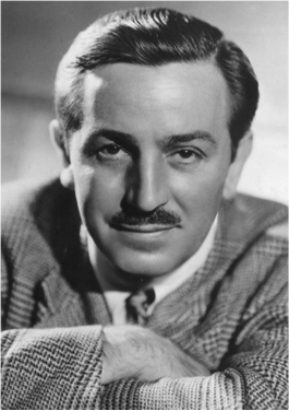
The
most famous creator amongst todays early stages is most likely Walter Elias
Disney who was born in Chicago in 1901 and a cofounder of Walt Disney
productions.He went to France in 1918 and when he came back he decided to set
up a business art studio with his friend, Ubbe Iwerks. Iwerks was the developer
of Mickey Mouse the first big hit of Disney but was in the shadow of Walt
Disney and not much has been written about him until lately (Crafton, 1993).

Early
devices
Early
Creators
In
animated cartoons do not appear to own one single creator. In spite of this,
few individuals will be mentioned who contributed to animation within the
starting.
Georges
Méliès, a French magician and director of the Théâtre Robert-Haudin (Ezra,
2000), revealed a way currently called stop-motion animation inadvertently once
his camera broke down. He is well known amongst the French community for his
tribute to film animation during the first decades of the 20th century. James
Stuart Blackton was an American filmmaker who was one of the first people to
use the techniques of stop-motion, discovered by Méliès, and hand-drawn
animation. At times he is referred to as the father of American animation. He
was a newspaper cartoonist who created the first animated film ever created,
Humorous Phases of Funny Faces in 1906. It was also the first cartoon
to use the single frame method and was projected at 20 frames per second.
The
person that helped outline this new trade was Winsor McCay, who was a comic-strip
animator and sketch creator at New York Herald. He was the first to establish
the technical technique of animating graphics. He used popular characters from
his comic strip. First came Little Nemo in Slumberland (1911) with 4.000 hand-drawn
frames, followed by How a Mosquito Operates (1912) with 6.000 frames. His first
undefeated cartoon character was a brontosaurus named Gertie in Gertie the Dinosour
which came out in 1914 and consisted of 10.000 drawings (Dirks, n.d &
Bukatman, 2006).
The
most famous creator amongst todays early stages is most likely Walter Elias
Disney who was born in Chicago in 1901 and a cofounder of Walt Disney
productions.He went to France in 1918 and when he came back he decided to set
up a business art studio with his friend, Ubbe Iwerks. Iwerks was the developer
of Mickey Mouse the first big hit of Disney but was in the shadow of Walt
Disney and not much has been written about him until lately (Crafton, 1993).
The
inspiration came from flipbooks – sequential drawings that produced an illusion
of motion when thumbed. According to Crafton (1993) the earliest date for which
animation was first commercially exploited was in 1898 despite the lack of documentation.
It is clear that animated films coincide with movie films. They were black and
white at first, then came sound and colour.
Progression of cartoons as they are known today, would not be possible if it were not for the technology used behind the scenes. There are a few devices which are a part of the early history of animation and these devices go back to the 19th century.
.jpg)
Flipbooks
The
first device is the Phenakistoscope invented in 1831 by Joseph Plateu, a scientist
and former art student. It can be described as a rotating disc with about 16
pictures, each slightly different, and can only be viewed by one person at a
time.

Phenakistoscope
Subsequently
came the Zoetrope designed by William George Horner in 1834 and was named “Daedalum”
or the wheel of the devil. However, it did not become popular
until the 1860‘s when it was unproved by creators in both England
and America. The American developer, named the device Zoetrope which means
wheel of life.
.jpg)
Zoetrope
The Kinetoscope
was a device designed for films to be sighted individually through the window
of a dresser cover its components. First described by Thomas Edison in 1888 but
was largely developed by his employee William Kennedy Laurie Dickson around
1890. The same people invented the Kinetograph, an innovative motion picture
camera.
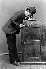
Kinetoscope
The Praxinoscope
came after the Zoetrope and was inventend in France by Charles-Émile Renaud. Like
the Zoetrope, it used a strip of pictures placed around the inner surface of a
spinning cylinder. It was a sort of projector different from the devices, which
had emerged before, where just one person at time could look at the films
through a small hole.

The
inspiration came from flipbooks – sequential drawings that produced an illusion
of motion when thumbed. According to Crafton (1993) the earliest date for which
animation was first commercially exploited was in 1898 despite the lack of documentation.
It is clear that animated films coincide with movie films. They were black and
white at first, then came sound and colour.
Progression of cartoons as they are known today, would not be possible if it were not for the technology used behind the scenes. There are a few devices which are a part of the early history of animation and these devices go back to the 19th century.
Flipbooks
The
first device is the Phenakistoscope invented in 1831 by Joseph Plateu, a scientist
and former art student. It can be described as a rotating disc with about 16
pictures, each slightly different, and can only be viewed by one person at a
time.
Phenakistoscope
Subsequently
came the Zoetrope designed by William George Horner in 1834 and was named “Daedalum”
or the wheel of the devil. However, it did not become popular
until the 1860‘s when it was unproved by creators in both England
and America. The American developer, named the device Zoetrope which means
wheel of life.
Zoetrope
The Kinetoscope
was a device designed for films to be sighted individually through the window
of a dresser cover its components. First described by Thomas Edison in 1888 but
was largely developed by his employee William Kennedy Laurie Dickson around
1890. The same people invented the Kinetograph, an innovative motion picture
camera.
Kinetoscope
The Praxinoscope
came after the Zoetrope and was inventend in France by Charles-Émile Renaud. Like
the Zoetrope, it used a strip of pictures placed around the inner surface of a
spinning cylinder. It was a sort of projector different from the devices, which
had emerged before, where just one person at time could look at the films
through a small hole.
Praxinoscope
Animation
Many producers
picked their brains, trying to understand the tricks behind the moving objects.
They used wires to make the objects move, which is a well known trick today
(special effects), both by magicians and movies This is when the battle started
to be about the characters and not the technology since it was being
standardized, as happens with new technology that becomes widespread.
It is
apparent that though the animated cartoons, we know these days have an extended
history, technology and evolution are changing the way things are done. There
is a shift in several cartoons and that they are just being generated with the aid
of computers, however, others still use hand drawn animations. The newest version
of Mickey Mouse is in no way the Mickey Mouse known 50 years ago. Having a combination
of each is the best way to go. Walt Disney has been producing both hand drawn
and CGI (computer-generated imagery) films for some time now. Maybe the rationale
is that they apprehend what their customers need. The younger people that do
not know what was in the past might not care, but the older ones do. Cartoon
animation is certainly not just for children, it is for the parents and grandparents
as well. Hopefully companies will not close their hand drawing departments as
some have done and simply focus on CGI. A mixture of both is essential. 
References
Bukatman,
S. (2006). Comics and the Critique of Chronophotography, or 'He Never Knew When
It Was Coming!'[Electronic version]. Animation, 83-103.
Crafton,
D. C. (1993). Before Mickey: The animated film, 1898 - 1928. Chicago: The
University
of Chicago Press. Retrieved, from Google Book Search:
Dirks,
T. (n.d.). Animated F ilms. Retrieved from Filmsite.org: http://www.filmsite.org/animatedfilms.html
Ezra,
E. (2000). Georges Méliès (French Film Directors). Manchester: Manchester
Random House, Inc. (2001).
Random House Webster's Unabridged Dictionary. New York: Random House, Inc.
Literature Reviews: (Article)
Praxinoscope
Animation
Many producers
picked their brains, trying to understand the tricks behind the moving objects.
They used wires to make the objects move, which is a well known trick today
(special effects), both by magicians and movies This is when the battle started
to be about the characters and not the technology since it was being
standardized, as happens with new technology that becomes widespread.
It is
apparent that though the animated cartoons, we know these days have an extended
history, technology and evolution are changing the way things are done. There
is a shift in several cartoons and that they are just being generated with the aid
of computers, however, others still use hand drawn animations. The newest version
of Mickey Mouse is in no way the Mickey Mouse known 50 years ago. Having a combination
of each is the best way to go. Walt Disney has been producing both hand drawn
and CGI (computer-generated imagery) films for some time now. Maybe the rationale
is that they apprehend what their customers need. The younger people that do
not know what was in the past might not care, but the older ones do. Cartoon
animation is certainly not just for children, it is for the parents and grandparents
as well. Hopefully companies will not close their hand drawing departments as
some have done and simply focus on CGI. A mixture of both is essential.
References
Bukatman,
S. (2006). Comics and the Critique of Chronophotography, or 'He Never Knew When
It Was Coming!'[Electronic version]. Animation, 83-103.
Crafton,
D. C. (1993). Before Mickey: The animated film, 1898 - 1928. Chicago: The
University
of Chicago Press. Retrieved, from Google Book Search:
http://books.google.com/books?id=yaeJFVTedysC&printsec=frontcover&dq=donal+crafton
Dirks,
T. (n.d.). Animated F ilms. Retrieved from Filmsite.org: http://www.filmsite.org/animatedfilms.html
Ezra,
E. (2000). Georges Méliès (French Film Directors). Manchester: Manchester
University
Press.
Random House, Inc. (2001).
Random House Webster's Unabridged Dictionary. New York: Random House, Inc.
What is beautiful is Good, 1972. ( Online ) Available at:
http://garfield.library.upenn.edu/classics1990EH311000001.pdf
http://www.acrwebsite.org/search/view-conference-proceedings.aspx?Id=9843
Although the article does not discuss character
design and shape, one can match how artists work with visual characters in
order to express personality in a character design, thus, I would say that this
kind of cognitive bias is very basic in character design.
The author’s concluded that really attractive
characters are assigned more good qualities, including personality characters,
overall happiness and career success, related to an unattractive person. This
usually stated because the “ what is
beautiful is good stereotype” and it is something that’s used regularly in
character design.
More Researches
A
comparison of body language between two characters.
How
a character ways their physical weight can decide them as individuals and also
tell us something about their personality, which part of their body they main
with is especially useful: Thinkers with their heads, heroes with their chests,
lazy types with the pelvis, cowards with their knees, and soon. A person with a
small point of contact with the ground will also appear lighter than a person
with more contact with the ground. Body language affects how others see us and
there are many non-verbal expressions that can be considered when developing a
character. Power and dominance rotates around expanding: To take up space and
open up, while the feeling of powerlessness is often shown by doing the
opposite: To close up and make ourselves small. This is a very natural behaviour that can be seen across the animal kingdom.

Literature Reviews: ( 3 Relevant Chapter)
Solarski, chris 2012. Drawing Basics and video Game Art, first edition. Watson Guptill Publications, New York.
Kenny, Ray 2014. Finish your Film!, first edition, Focal press publications, Burlington Canada.
( Online Available at: http://books google.com.mt/books? id=NSR2AwAAQBAJ7pg=PA293&DQ=Visual+Stereotypes+characters+design+animation&hl-en&sa=X&ei=U0FpVIOoKMXxaKURgrgH&ved=OCCKQ6AEwAgv=onepage&q=Visual%20Stereotypes%20characters%20design%20animation&f=false
Ray,Disney 2006. Animation from pencils to
pixels.publications.UK ( Online) Available at:
http://www.amazon.com/Animation-Pencils-Pixels-Classical-Techniques/dp/0240806700rs).
In the 3 relevant chapters involves some
information about the shape characters, which is written by the authors Bancroft
Tom and Solarskii, Chris.. These information was published in 1996 and 2012, in
the Wastson Nuptial and Publications, New York. They investigated how the
shapes have an endless variety of characteristics, each one conveying diverse
message to the people.
The shapes have a way of communicating commonly,
because the idea of circular opposed to triangular shapes originate very much
from nature. Rounded shapes tend to be safe, while angular shapes make us
carful. These natural responses are focused around the
feeling of touch, while this sense is not present in visual art, the viewers
have a tendency to apply their genuine encounters onto comparable shapes. Any
form from life can be transformed into a shape and the idea of shapes all implies
different characters.

However,
the shape has a way of communicating universally, because the concept of
circular versus triangular shapes originates very much from nature. Rounded
shapes tend to be safe, while angular shapes make us cautious. These natural
reactions are based on the sense of touch and, while this sense is not present
in visual art, the viewers tend to use their real-life experience onto similar
shapes. Any form from life can be translated into a shape and the abstractions
of shapes all indicate different character.


A Steady rock
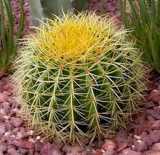
A Thorny Cactus


Triangle Square Circle
-Creative Character In Design Shapes-
The previous section of this article
explored the visual perceptions that we companion with primary shapes. In this
section we will look at how these shapes can help us make sense of various
character designs in the context of dynamic composition.
“ The shape variety of emotions
should NOT be used as a design formula but as a conceptual tool to
calculate artwork and identify problem areas ”. The
psychological basis of these shapes means that they are a
timeless feature of art, allowing us to find rapports between seemingly
different artworks, and better understand the aesthetics of video
games ".
There are
many different basic shapes have been used in classical art to influence the
viewer's emotions.


The three shape is related about three
different character’s design, these are described the visual message has to be
clear to be effective and exploring a character’s shape in an first stage
of the design phase makes it easier to confirm that character’s
personality early in the process, the general shape will represent
a character’s personality.
Circles
Cirved and Circles shapes
are studied the friendliest as they have no sharp or dangerous corners.
Circles shapes in nature have a movement of being soft, harmless
and evoke such as intelligent characters. Many of the most well
known protagonists are designed around circular concepts.

Triangle
Triangle relates to
diagonal and strong, angular lines and are the most dynamic of the three
shapes. Bad guys and antiheroes are often based upon dominant triangular
concept, as they appear malicious, sinister and communicate with the most
aggression. It is the circle’s most opposing shape and often used
for antagonists.

Square
Square shapes relate
to straight vertical and horizontal lines that communicate strength, stability and
confidence. Square can both be large and daunting or comforting. They
often describe steadfast characters that are dependable and are commonly used
for superheroes or heavy.

Compare

A pointy shape seems very aggressive when placed next to circle,
which in turn seems very tranquil.

Realism Versus Idealisation
Character design sections from realism to idealisation
and the silhouette of a human character will contrast depending on how stylised a game is. A stylised game will-typically let for more creativity, exaggerated shapes and parts when it comes to important a character through a famous
silhouette. Proportions can be different in infinite ways and they are particularly
useful to create many various human-based characters: A character with a small
head and a large body will communicate in an only different way compared to a
character with a small body and a large head.
"Pictorial Vocabulary" by Scott McCloud (1993)
Scott MCCloud introduced a
pictorial volubly in his book Understanding Comics: The Invisible Art ( 1993).
With the help of a big triangle, he
mapped comic art in relation to reality ( realism), meaning (language, or idealisation) and the picture plane (abstraction) - in essence: Different
styles. The triangle of this diagram can be used to study the concept of the
style in video games and animated movies too.

The Big Triangle as it is referred to by Scott McCloud again divided into three
Areas and all connected up into a triangle that is a map of
the visual
Art and Communication.

Pictorial vocabulary, 1993. ( Online ) Available at:
Visual Stereotypes
The information about,
stereotypical character design communication that have worked well in many
video games and movies. To take this beginning of the hero versus the villain
to its extremes, it could be described in a very abstract way with the use of
shapes: A ball vs. a triangle.

Visual stereotypes is the all
elements of art, and many people share a similar visual vocabulary when it
comes to references and ideas: The sky is blue, red means blood, a cranium is a
sign of death, green is associated with nature and so on. Sometimes it can be very
effective for an artist to rely on these kind of ideas that already exist when
creating a new design, also over explicitly or by the use of delicate signs,
given the setting. However, as long as an idea is well started for the
appointment, it is possible to give any visual cue any meaning .By creating
interesting shows on common conceptions it is possible to create a character
design that is more single and interesting, which may result in an even more
memorable character that leaves a greater impression on the audience.
In Toy Story 3 (2010),
produced by Pixar Animation Studios, the main villain is a soft and cuddly bear
- a friendly circle - and another visual element is used to show something
about his personality: Colour. Purple is a tricky colour that has often been
used to show evil and this is a great example of how a combination of visual
elements together help in communicating a character's personality.

Shape in Various Video Games and Animated Movies:
A brief analysis of a number of video games and animated
movies to form a general idea of how they have used shape in order to
communicate good and evil characters particularly by looking at some of the
characters silhouettes.

A contrast of Stitch’s two different
forms

Lilo
& Stitch (2002)
The two character of Lilo & Stitch ( 2002) produced by
Walt Disney Feature Animation. It is clearly based on a circular concept and
also a very likeable character. His eyes
are more thin and the use of a triangular shape on his suit speaks for itself. His main colour is also a violent red instead of the more calm blue.
Mini Ninjas ( 2009 )
One of the heroes and
one of the enemies in Mini Ninjas.Mini
Ninjas, developed by 10 Interactive, it is very much designed around shape. The
characters are all based on circular concepts, while the opponents are based on
a concept of much more angular shapes. The visual style of the game is usually
cute and friendly and many of the enemy characters even share the heroes’ soft
proportions (short bodies and big heads), but the diffusing shapes communicate
in an only different way.

Tales of Monkey Island ( 2009)
Guybrush Threepwod and Lechuck in Tales of
Monkey Island

The
contrast between the characters in Tales of Monkey Island developed by Telltale
Games becomes very clear when
contrasted: The triangular shape of LeChuck’s large pirate hat almost makes it
look like he develops horns. The jacket cuffs, boots and fingertips all provide
to his evil look and his body language suggests a loud and confident
personality. Guy brush seems to have a much more relaxed and laid-back
attitude; his major shape is like a slinky rectangle. The concept of “what is
beautiful is good” is also present.
Megmind ( 2010)

Up ( 2009)


One
of the main character’s of Up, produced by Pixar Animation Studios, is the
grouchy Carl: A persistent old man who just wants to stay put and has a usually
solid and static manner that is much revealed in his square-like shape. Charles
Muntz - the antagonist - has a much more angular concept as seen for example in
his head, shoes and cane. The jacket also gives him a very triangular major
shape. Muntz’ leader dog, Alpha, also has a much more malicious appearance
compared to Dug’s friendly expression - a triangle versus a circle. This is
something that we can relate to reality as well: Aggressive dogs tend to have
more angular concepts than the general, more circular-based, family dogs.
No comments:
Post a Comment